Deep Flat Design
Any product designer worth their salt will tell you that flat design has been around for almost 10 years now, is hugely successful, and has been adopted by anyone who’s anyone. This rise in its success can only be attributed to one thing: as human beings we desire order and we love symbolism. These things work to create a shortcut in our brains, taking something complex, boiling it down to its base components, and making it more easily understood and quickly digested. The big BUT here, though, is that the success of flat design has become its own downfall. The time comes when the familiar becomes boring and the boring becomes ignorable.
Alongside it and even before flat design existed, 3D design had been used very successfully for years in everything from animation and graphic design through to packaging and product. Its aim is to create rich visuals that bring a design to life and pull it off the page. However traditionally, even with its success in those arenas, it has often been written off as too rich and browser-heavy for web.
But this is where what works must inevitably evolve into something better, and this year (and the last) saw exactly that: the rise of a peculiar new combination of the two methods. Like the mixing of oil and water, you wouldn’t expect that these two elements could co-exist in harmony, but this is where the striking new combo of “Deep Flat” comes into its own.
The technique sees the use of flat elements stacked to create the illusion of depth. In addition, shadow, light, reflection and simple animations are combined to produce a rich environment which works to give these flat elements more of a fullness and make them feel more interactive and tactile. In combination with 3D static and moving visuals, these can work to deliver an even greater user experience.
Human Centred Design
HCD is not a new concept, but 2020 will see product designers saying ‘enough is enough’. They have made it clear that they are tired of websites and applications designed without any consideration of what their user wants. For too long designers have been forced to take things into their own hands using “empathy” and “gut instinct” to create something that, let’s face it, places style firmly over function. Whilst these sites and applications may look pretty on the surface, they inevitably knock square pegs into round holes, and create design systems that fall down more often than not.
But… modern product and UX designers are saying “no more!!”. In today’s data-driven era, we have seen the rise of switched-on designers that have seen the light and have realised that they cannot create robust design solutions without first understanding the design problem.
How do they do this, you ask? The only way is to place your user at the centre of everything you do, adopting a fail-fast approach: design, test, iterate, and test some more.
User workshops, stakeholder interviews, journey mapping, user observation, and low-fi prototyping are just some of the methods that play a key role. Just getting in a room with a few key people can save a small fortune and a lot of wasted time creating multiple design outcomes. The good news is technology is here to help – gone are the days where you need to spend a fortune on UX labs and expensive focus groups. The core principle is just to gain understanding.
Additionally, third party tools work wonders to trim the fat from a hefty UX budget:
Analytics & Heat Mapping
- Hot Jar (Free up to 1000 hits) – great for gathering qualitative and survey data.
- Google Analytics (Free) – great for picking through quantitative data.
Prototyping
- Sketch – A product designers classic.
- Invision – If you need a quick prototype, this is the one for you.
- XD – Bringing up the rear, Adobe’s attempt – which is getting better with every release and gradually mopping up the market share.
User Testing
- Usertesting.com – See, hear and talk to your customers as they engage with your products.
Organisation
- Airtable – Order your insights into actionable data that you are able to plan and share with everyone.
AB Testing
Optimizly – Once you have a fully functional website, if you want real users engaging in different designed solutions this is great to test and deploy your beautifully coded web designs.
But, setting these amazing tools aside, the most important thing is getting hands-on with users and collecting as much information as you can, direct from the source. If you can honestly say that you have put in the work, you know what your end users want, and you have the data to back it up – then you are a 2020 designer my friend.
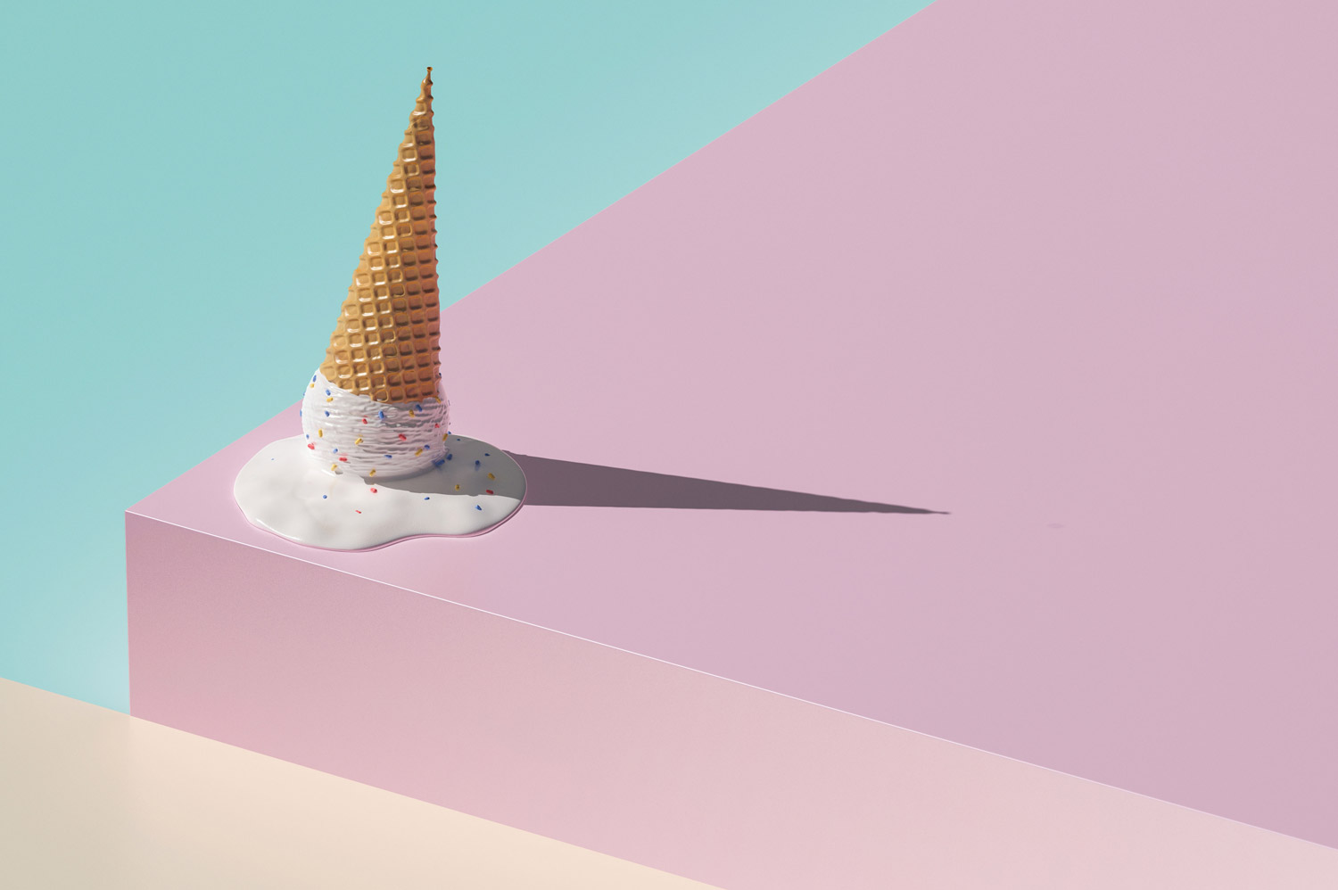
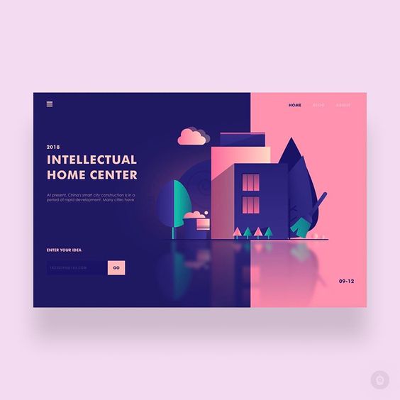
Bespoke Abstract Illustration
If you are anything like me, it feels like as a consumer you are bombarded by a million images every minute. That’s why it is no surprise that designers across the land, in various different disciplines, are trying everything they can to grab people’s attention.
For this reason, last year saw a meteoric rise of some really cool but surreal and abstract illustrations. These illustrations, when done right, really connect with the content and can evoke an emotional connection that can be found wanting with your bog standard ‘does exactly what it says on the tin’ imagery.
The key to these types of illustrations working is context. If users can’t see a connection to the message – then it just comes off as weird and strange, and people will reject it. Where the magic happens is when the illustrations look nothing like the user has seen before but, almost more importantly, they contribute to the understanding of the content.
When done in this way, they give a brand real personality and deliver something emotive and playful that creates a true connection with the user.
For a further twist, another emerging trend of 2019-2020 is combining these illustrations with a Gradient 2.0. Usually vibrant in colour, these complementary coloured gradients are subtle and simple; normally with a distinct light source, these gradients bring depth and dimension to any interface.
Abstract designs of 2019-2020 that draw the eye:
Rich Transitions & Animations
The discipline of motion design usually goes hand in hand with 2D and 3D video animation but, year-by-year, with computers, browsers and connections getting more and more powerful, we are seeing these skills used to good effect in web and app design.
Psychology plays a big role in why motion is important in design communication. Human beings’ visual focal point is very small – about the size of a tennis ball – meaning we can only see a very specific area of the screen at once. Everything in the surrounding visual field is blurred to our perception. There are ways to attract the eye; size, contrast and colour are the core tools traditional design reaches to to tell the story. But, due to a hangover from when we hung out in caves and there was a pretty important requirement to spot a leopard running in your direction, by far the thing that attracts the eye more than anything else is movement. Movement can be extremely effective; a caveat to this is making sure any animation is purposeful and not overdone. As sites like lingscars.com show, there is nothing more annoying and downright gag-worthy than loads of irritating elements pulling your focus left, right, and centre.
However – and it’s a mammoth however – used in the right way, adding motion-specific elements can not only attract a user’s attention, but also creates an opportunity to bring order to content and give users a clear visual path to follow.
It can be difficult to get your head around motion design. If you have not yet familiarised yourself with software that allows you to create motion graphics, then prepare yourself, because there are no better tools than Adobe AfterEffects, which allows you to better tell a story, and gives you space to create.
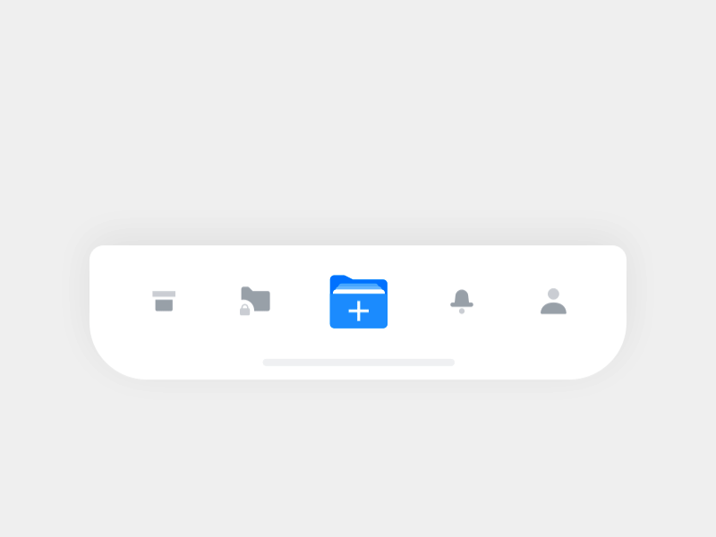
Micro-Interactions
MI has been around for what seems like an age now but the industry has gone through a bit of a shuffle in the past couple of years. The terms web designer or app designer have faded into obscurity and become separate disciplines, with people dropping into a number of varying roles: UX designers, UX researchers and UI designers. If you are a UI designer or a blanket product designer, you’re probably accustomed to using MI on a daily basis.
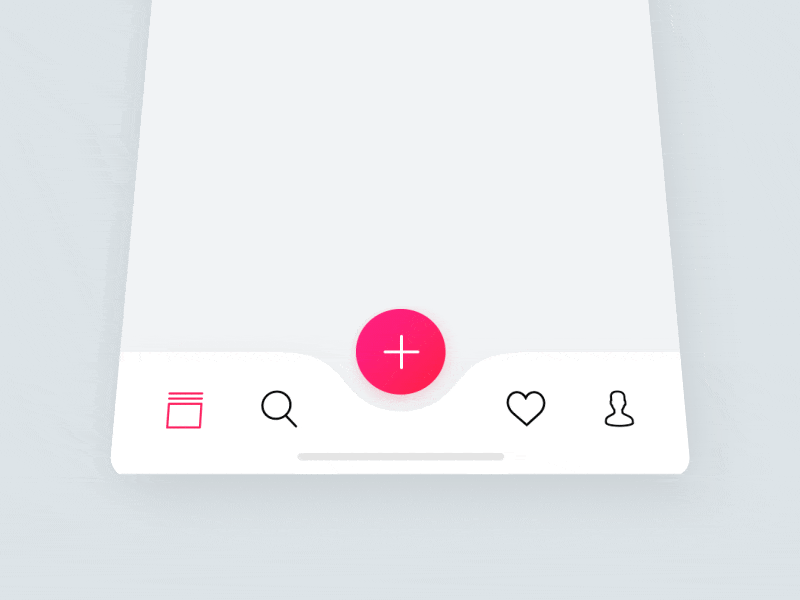
The reason micro-interactions, in the past, have been a ‘nice to have’ rather than a ‘must have’ is that they can be rher time-intensive to produce, but with individual disciplines, dedicating more time to them is now possible. MI is the perfect tool to convey understanding of how a design system works, and furthermore brings a user’s interaction to life. Ultimately, these small things make a big difference – taking users from a basic experience to an extraordinary one that they will remember.